Solving hidden pain in customer claims

Reducing operational cost by helping customers resolve fee-related claims in self-service.

UX Design Bank Millennium 2024
Customer claims in digital banking

What I did

Leading UX Design, including userflows, customer journey mapping and wireframes

Led collaboration with UI designer, researcher and UX writer

Worked with PM, devs and stakeholders from discovery to production

Results

Significant reduction in claims filled overall

Reduction in customer service calls

The problem

Thousands of fee related claims were received monthly by the call center team, despite most cases being really simple to explain based on existing product terms. Usually customers would not know that they didn't cover certain terms for a free product in a given month and they would want to report such fee as improper.

Additionally claims back-office team had to report and handle every claim, meaning they had to work a lot more due to those very simple cases. Bank would typically return the fee as a result of claim. This was part of the issue. The other part was workload.

A typical fee related claim case could require approximately 15 minutes for a call center employee.

Therefore, bank, wanted to reduce operational cost by enabling customers to self-service their claims and automate claims resolution process without call center support.

My impact

I joined as lead UX designer to revive a project that had stalled after its first concept failed user validation. I led the full redesign from workshops during discovery, through designing user flows and final UX designs, to supporting shipping a simplified claims flow to production. The solution measurably reduced both the volume of claims filed and the number of customer service contacts.

Initial solution

Before I joined the project, an initial concept had already been designed. The idea was based on a assumption: If customer understands the fee, they will not need to file the complaint.

This sparked the idea of FAQ. This way, if customers would encounter fee they didn't expect, they could learn about product terms and in some cases resign from filing a claim. They would always have a CTA for claims filling if they wanted to.

First experience flow looked like this:

01

Customers sees a fee in account  history

They don't know why fee appeared and want to find explanation from bank

02

Contact center

Customer would want to find contact bank so they might encounter FAQ section in click on that

03

FAQ and fee explanation

Customer had to get through educational content before accessing claims process

04

Optional claims process

Accessed by CTA on FAQ, this was the start of claims process

What went wrong and my challenge

User research revealed critical problem: customers just wanted to file a claim but had to go through FAQ everytime they wanted to. Constructing flow with FAQ upfront confused people.

Additionally, the claims process itself was way too long. Users wanted short, one or two screen process.

At this stage, project was frozen. Some time later I was asked to join the initiative and deliver better experience for customers. From the start, it was obvious that product strategy would remain the same: Reduction in contacts to call center by enabling self-service.

Discovery stage

I reviewed all the information that was already gathered. This project was co-led with the project manager with me responsible for designing final experience. We talked about properly redefining customer problem with product strategy in mind

Education remained important

It just could not be made a mandatory step

The claims process had to be shorter

No longer dragging customers through multiple screens.

Claims tracking as potential benefit

At the time customers had no option to track claims. We wanted to give them this option.

There was still many unknows

As a fresh product team, we didn't know how claims really worked internally. That was something we had to learn from stakeholders.

This synthesised our project goal into a real outcome:

Create claims hub in mobile app and digital banking to provide all-in-one place to file and manage claims from customer side, with clear CTAs and short forms.

Workshops with call-center

I wanted to talk to someone in front of the issue: call center employees. They would have clearest insight into the issue and they would also provide some hard data. I facilitated a workshop with call center representatives, which surfaced key insights:

Half the time, customers didn't even know product terms

This made it clear we needed to create a better educational experience

Customers are annoyed but first eager to find a reason for a fee.

Of course, some of them just want to file a claim. Both needs had to be synthesised into one flow.

I also got access to more direct data: customer complaints themselves. Due to it being sensitive information I can't say much, what I can say is that it was very eye-opening experience from UX perspective. Seeing first-hand what customers feel was essential to understand their perspective better.

What's next

We started a series of workshops with product team and stakeholders. This gave us field for discussing our ideas and learning how claims back-office operates within already existing systems.

Below I showcase decisions we made during workshops that led to final product we implemented to production.

Creating scalable claims hub

First important part was constructing the flow for claims filing. Customers want to be guided directly. That's why the important decision was to build scalable hub which would contain claim filling forms divided by categories, with additional claims tracking option.

I decided to keep entry point from first iteration. For filling claims or learning other information, customers want to contact bank so they naturally navigate to contact center in the mobile app.

After that, I've constructed simple information architecture. This allows to clearly lead customer from start to claims filling process.

Final flow:

01

Customers sees a fee in account  history

They don't know why fee appeared and want to find explanation from bank

02

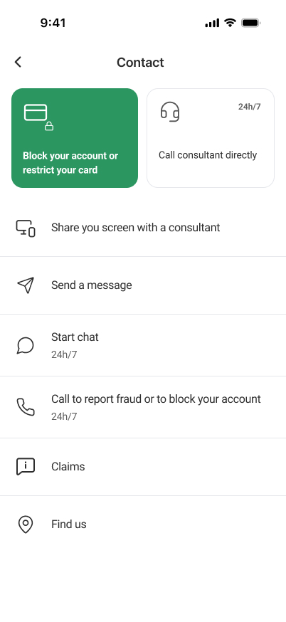
Claims entrypoint in contact center

Customers have easily visible entrance to fulfill their goal

03

Claims filling process as main feature

Customers immediately can file a claim and get instant feedback

04

Fee return

If customer reported max 3 fees, it is automatically returned within couple of minutes

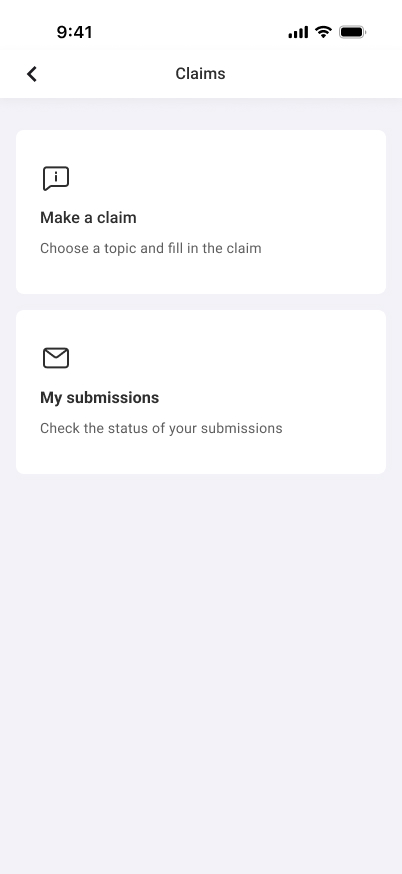
Claims hub entry

01

Customer starts in contact center

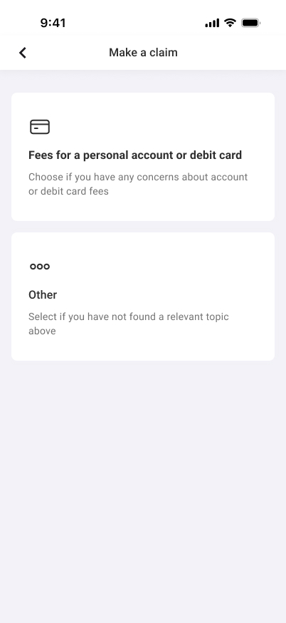
Claims hub categories

02

Main action in the hub is filling a claim, that's most visible

Claims hub fee selection

03

Categories allow for future expansion of the hub

Total simplification of claims filling process

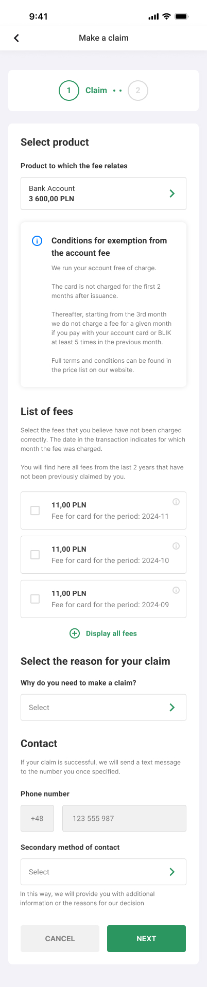
I've listened to research result very carefully: customers were annoyed for a too long process. That's why I focused on creating onepage form (excluding necessary summary bank uses as a design system pattern).

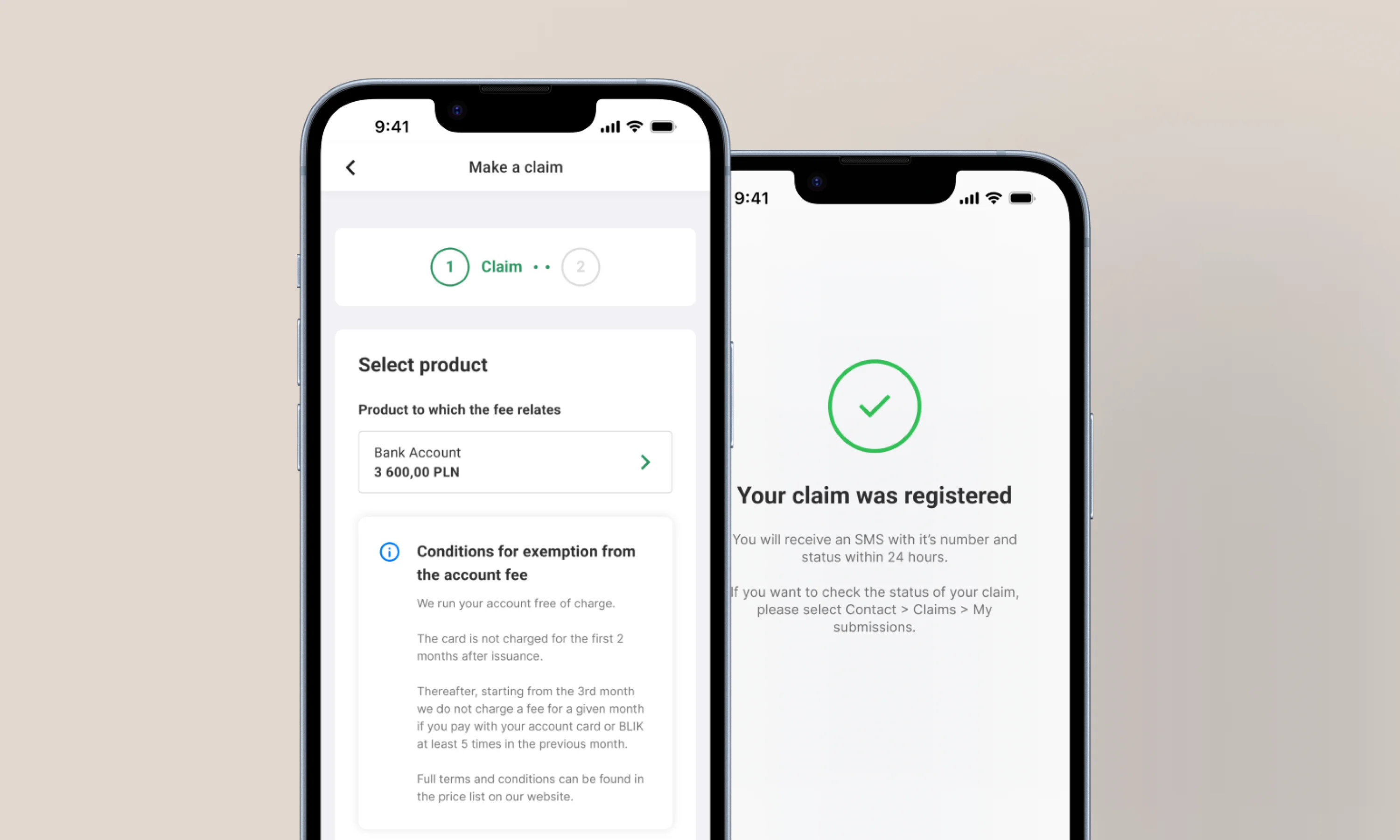
One-page form, account selected

01

At first user sees default account selected and terms below

One-page form, fee selection

02

They select a fee they want to report

One-page form, information gathered

03

At the end necessary information is gathered

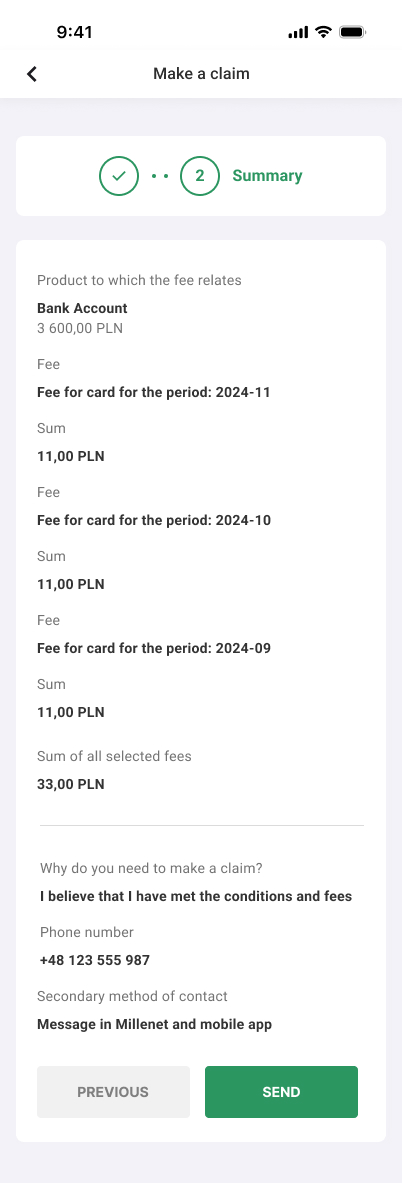
Claim summary

04

Short summary, as needed due to patterns of internal design system

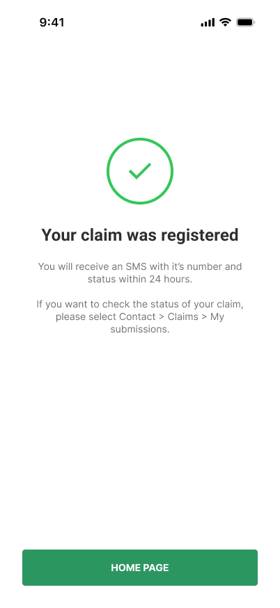
Claim registration confirmation

05

Claim registration which usually ends with fee return within couple of minutes

Simplifying complex product terms

One of my biggest contributions was shaping educational experience. The explanations behind account fees existed, but they were written using internal and regulatory language that was difficult for customers to understand. They were also completely absent from digital banking only to be found deep in bank documents on the website.

After advocating the need for better UX writing of those terms with the stakeholders, I led the effort to translate dozens of product terms into plain language. During that process, a UX writer has helped me to shape final outcome.

Why was it important?

During user research and later discovery, one major insight was that customers are confused about product terms. They either don't know them or do not understand the easily. Making terms understandable became one of the most important parts of the solution.

Old terms

We do not charge fees if your Bank 360 Prestige account receives external inflows of at least PLN 20,000 in a given calendar month

or if you have assets* in the Bank Group with a minimum value of PLN 200,000 (we do not include inflows from other accounts held by the account holder at our bank or from accounts held at the Brokerage Office in the calculation of total inflows from other accounts held by the account holder at our bank, accounts held at the Brokerage Office, or refunds to this account for transactions made with debit cards or BLIK).

If you have more than one Millennium 360 Prestige account, the condition must be met separately for each of these accounts.

New terms

We run your account free of charge.

The card is not charged for the first 2 months after issuance.

Thereafter, starting from the 3rd month, we do not charge a fee for a given month if you pay with your account card or BLIK at least 5 times in the previous month

Full terms and conditions can be found in the price list on our website

What about product terms shown in more visible place in the app?

It was a question I raised during workshops. I even experimented with the solution, putting fee exemption tracking on a dashboard. Unfortunately, this was cut for scope reasons. Bank wanted to deliver claims functionality and playing with the dashboard or other places would require a lot more resources we didn't have.

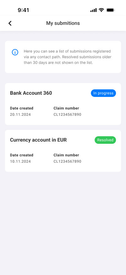
Tracking filled claims

We spotted an additional benefit of having a claims hub: the ability to track existing claims for customers. Before there was no way to find the status of a claim. Customers would sometimes contact call center to get that information. Bank had that status in internal systems, all we had to do was to surface it to the customers.

At first we wanted to do advanced tracking, with detailed information about selected fees and product name but due to technological constraint we had to set on status, opening and resolution date. It was still a big benefit in contrast to no information at all.

Submitted claims tracking

View of submitted claims tracking

Results

The redesigned solution was successfully delivered to production. I did post-launch verification in form of survey to selected customers. They were generally satisfied with the process and explained the process was quick and easy. Some of them stopped, when they have read presented product terms.

This is supported by data analysis, that showed some customers would usually stop and exit form at this stage. For most processes this drop-off would be seen as negative but here we actually achieved what we wanted: lowering number of claims overall.