
KYC Verification

Balancing user trust and regulatory needs to deliver KYC experience to over 2mln customers

UX Design Bank Millennium 2024
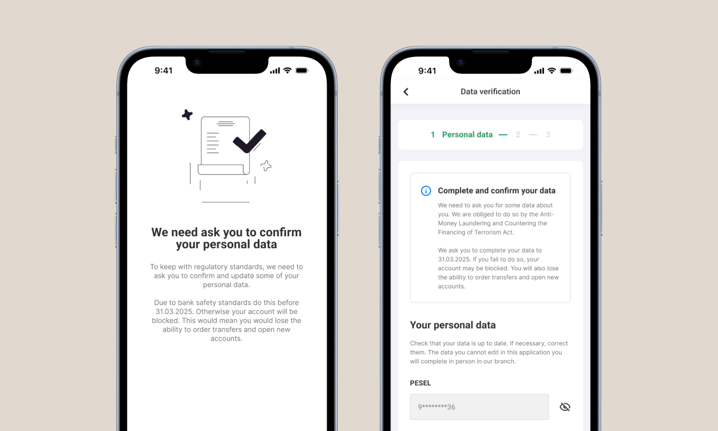
KYC verification screens in digital banking

What I did

Led UX design with mapping user flows, designing the experience beyond the core form, and creating prototypes.

Led collaboration with UI designer, researcher and UX writer

Worked closely with PM, devs and stakeholders from discovery to production

Results

KYC verification experience successfully delivered to over 2 million retail banking customers.

86% satisfaction rate, with around two-thirds of forms completed within the first month of sending the survey.

The problem

Banks are legally required to keep up-to-date information about their customers' financial situation. This is handled through KYC (Know Your Customer) verification: confirming identity, financial profile, and a few regulatory data points. In essence, it can be a survey for the customer to fill in.

Customers have very different expectations. For them, this can feel like a violation of their privacy. A bank asking sensitive financial questions comes as a surprise, and the natural reaction is suspicion.

There are consequences on both sides. A customer who ignores KYC risks having their account restricted. The bank faces regulatory exposure, and failing to gather this data can lead to real legal consequences.

What's the scope, then?

This project isn't just about designing a survey. It's about creating an experience built on trust and understanding while covering regulatory needs. There were several issues to tackle at once:

  • Project within highly regulated industry. Several pieces of information we had to gather were unchangeable. It was about reframing them, not designing an alternative.
  • It is for whole customer base. Use cases ranged from the most common to the most unusual: driven by a customer's products, nationality, or even geographical location.
  • It is a multi-channel experience. This project goes beyond app process. It lives alongside its own communication layer: notifications, in-app messages and direct contact with bank call center team.

This project focuses on the digital experience. There was also an analog version, conducted in bank branches, since not every customer has access to digital channels.

What's the goal?

The regulatory background meant the form was mandatory. On the timeline, customers had 3 months to fill it in from the moment they received it. After that it was still possible to complete, but we wanted to avoid that because of the possible consequences for the customer, such as having the account restricted.

Because of that, as close to 100% completion rate as possible was defined as main metric to follow.
My role

As lead UX Designer, I was responsible for the structure of the end-to-end customer journey and the key design decisions: what information is presented and when, where certain questions appear, and when to negotiate with stakeholders as regulation collided with customer experience.

In practice it meant:

  • Desk research including discovery, data analysis, benchmarking
  • Flows and wireframes for whole process and various cases
  • Co-leading UX research including IDIs, user testing and post-analysis implementation verification
  • Working with UX writer on key communication within the process.

Introduction to process

At first I was presented with the constraints described above: some questions were set in stone and had to be asked. I ran a series of workshops with stakeholders and the project team to understand those questions and find out what I could do to make it a great experience.

The takeaways: we had to ask for personal information (including full ID data and home address), what the customer's expected transactions are, what their sources of funds are and what they plan to do with them, and whether or not they are a politically exposed person.

Segmentation

One important piece of information was how we are planning to create segmentation:

  • Typical, everyday customer. They see the fewest questions and represent a significant share of the base. (Due to confidentiality, I can't share exact values.)
  • Specific, edge case customers. Customers from this group are very few and due to AML rules, they have the extended form to fill.

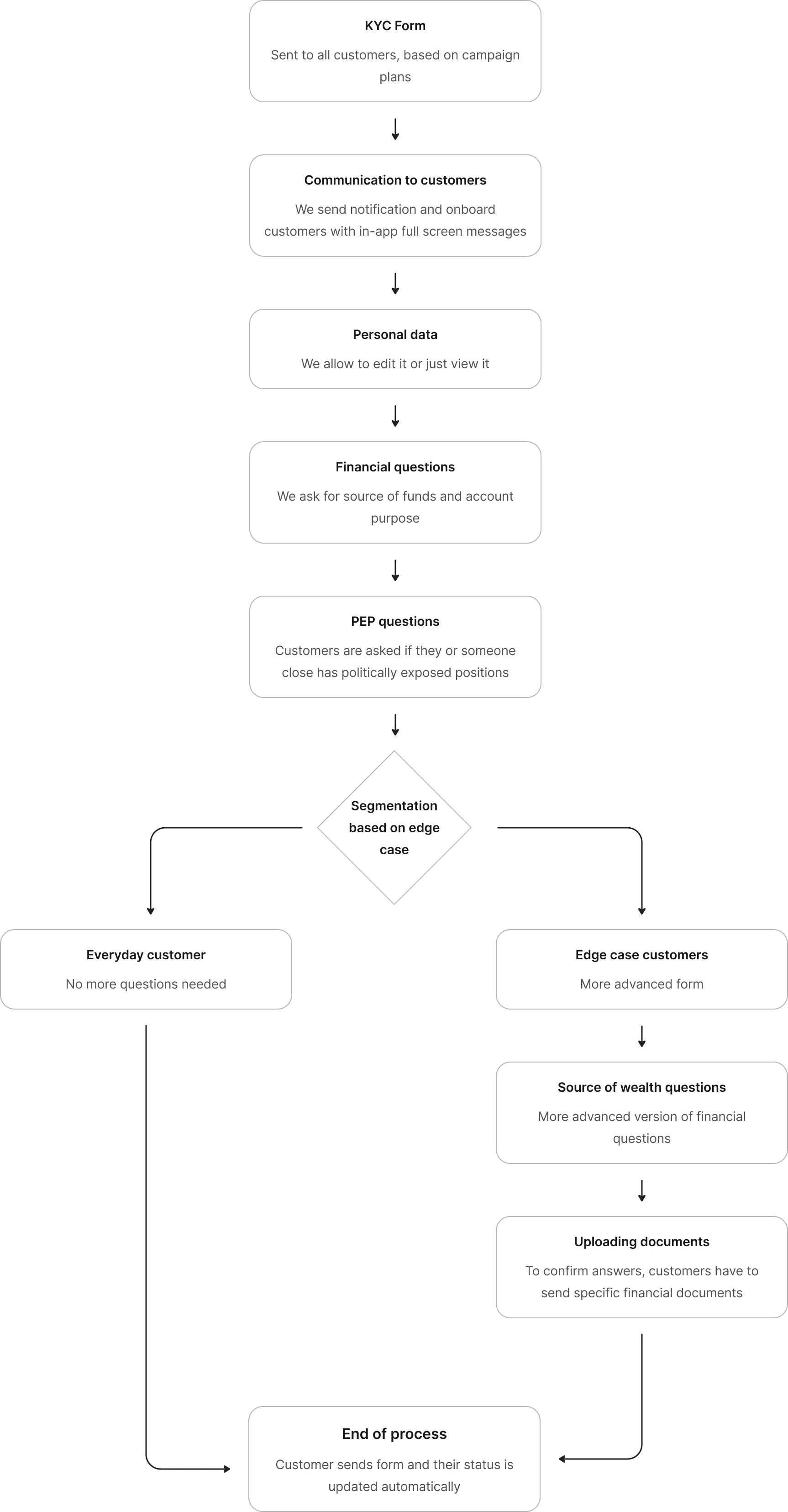
This led to the first process flow.

KYC process flow: from form delivery through personal data, financial and PEP questions, into segmentation that splits everyday and edge-case customers before the end of process

Benchmarking and market research

It was difficult to find information on how other apps approach this. KYC forms aren't common and are usually triggered on demand by the bank, not the customer. So I widened my research by looking at KYC onboarding in fintech apps like Revolut, Binance, and Coinbase. They take a more user-centric approach while still being required to cover the same regulations.

Apps are direct and approachable

They first and foremost tell the why, even if that information is uneasy.

Focus on safety of data

Security clearly matters to users, and apps state directly what they will do with the data.

Easy to follow, multiple steps

KYC onboarding in some apps was long, but breaking it into many steps made it easier to follow.

Great communication and updates within the process

UX writing stood out as very friendly and user-centric.

What decisions made to production

I started designing relatively quickly. Once I understood the process well enough and had drafted the first user flows, I designed a detailed, complete user flow. I then led the collaboration with the UI designer and UX writer.

IDIs and user testing

When I had process designed I led the effort to test it out with banks customers. Alongside UX researcher we invited 9 customers, gave them the prototype and asked them to go through the process. They were actively commenting the process and we also took the opportunity to find out more about their needs and perspective.

The findings were strong: among other things, customers openly said they are wary to give any personal data. They also felt process was too strongly worded. This insights gave me opportunity to create more friendly process and below I present key decisions that led to final design delivered to production.

Designing experience beyond core form

As I mentioned in the beginning this is a multi-channel process. During workshops with stakeholders and project team, I learned that communication layer, how we communicate, is as important as form itself. This required detailed attention.

With stakeholders I workshopped communication to customer. Generally some constraints were already put in place before discovery phase: for example I couldn't just choose any number of notifications, there was a more of less rigid system developed and I had to work within that system.

I also had to negotiate with stakeholders on any issues between business goals and user satisfaction.

I decided to focus on couple of points:

Define general structure of communication channels

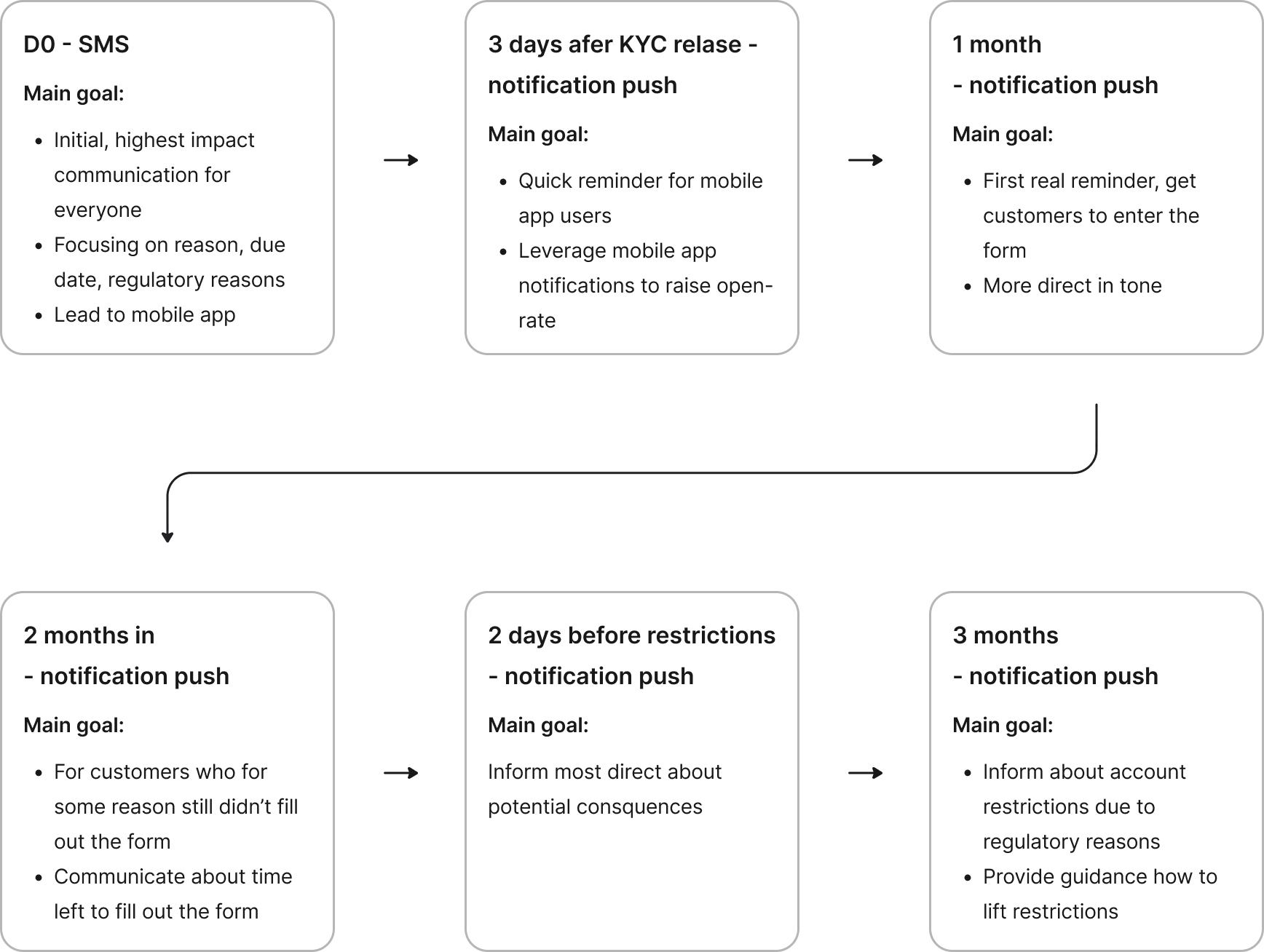
I needed to fully understand which channels are available (notifications, SMS or other) and how many there should be. This step had to be done with stakeholders who built aforementioned notification system. At first stakeholders wanted to provide lots of notifications. My argument and decision was to spread it out, since intense approach can lead to lower open-rate: people would get tired.

Also I put some logic behind it: for customers with mobile app only first SMS would be send. SMS was chosen because it can reach every customer. Later everything is done with app notifications, which also is a more secure channel. SMS was left for customers without a mobile app.

Communication timeline: an initial SMS at day zero, then in-app push notifications at 3 days, 1 month, 2 months, 2 days before restrictions and 3 months, each with its own goal

Fine-tuning what information to put in communication channels

With such extended multistep system it cleared out what I wanted to inform about KYC and regulative context in each step. First iteration I bet on revealing gradual information. In first SMS only core context: banks need to gather data due to regulatory reasons, next in app reveal more detailed information about exactly what, why and to which date.

Research revealed it was mistaken approach. I've imagined customers have much more trust in the bank as institution. They wanted detailed context and date first. Other information was less relevant. Questions why and by when were most important for them. The goal was as high completion rate as possible, so this became a critical point.

Framing the form

The division into concrete parts was one of most important designs decisions. Due to technical constraints some stakeholders wanted to create long, uninterrupted flow of questions, without any detailed descriptions within. My role was to create great experience while keeping high conversion rate and during workshops I discussed opportunities to expand technical specifications to include more context within the form.

I argued with various presenting outcomes based on different designs and including stakeholders at every stage. I led the design of shared vision and during multiple sessions managed to separate form into multiple sections with detailed micro-copy.

Personal data intro screen
Confirming personal data
Personal data details

Step 1

Quick introduction followed by confirming personal data. By default customer doesn't have to change anything. It means this part can just be read only for most customers.

Form questions with micro-copy
Form questions continued
Form questions with explanations

Step 2

More form heavy part. Every question has micro-copy to explain the context, especially regulatory reasons.

How to approach financial and political questions

What was the problem?

This was the hardest part. During testing customers were highly against gathering such data, for them it was a very private information. Some claimed this could make them leave the process

Research also revealed that long blocks of text and regulatory language is a big obstacle. No one wants to read it, customers skip it and result is less understanding the why and more frustration. On the other hand I couldn't just change the questions and it's content.

How I approached it

I led initiative to construct short, well-described UX micro-copy with UX writer. I wanted to remove any ambiguity from the process. After couple workshops we had great material to put into form. The solution was explaining why bank asks such questions and to provide guidance on what questions mean.

PEP question with extended explanation

01

PEP was difficult to explain, I provided extended explanation within section

Financial question with micro-copy

02

Here biggest confusion was "what would happen if I exceed amounts within question labels". That's why micro-copy explains that first.

Source of funds question with quick hints

03

Customers wanted quick explanation to questions about funds. I decided to use quick hints to explain it within question context.

Expanding over core customer base

As mentioned in userflow, we have edge case customer base to cover. There are two key differences: additonal question about source of wealth and requirement to upload documents confirming answers. This is difficult moment, people would have to find documents at home, so the design leans on clear instructions and concrete examples at the upload step.

Additional question and document upload section

01

Additional question and document upload section.

How the experience turned out

We delivered the project to production and began to follow metrics. KYC was released in batches to growing number of customers overfollowing months. Within first month of releasing KYC around 2/3 of customers have filled the form with over 90% open-rate and median time to fill form was just over 3 minutes. Considering long period of form availability, large consumer base and dificultness of the process those numbers show positive outcome. Completion rate would later fluctuate and after project launch there were more initiatives to further push it higher.

As other measure of user satisfaction I ran post-implementation survey to customers. I wanted to check their feedback:

We observed higher satisfaction rate

Compared to IDIs with old version, customers rated process higher.

Communication layer was understood to 97%

Customers didn't spot any major problems with how we communicate

Depending on section, between 85 to 95% of customers rated form as easy to fill

Compared to user testing before release it is highly satisfactory number.

Some corrections were needed

Form more surfaced in the app, more answers for financial questions was raised as needed parts to improve.

What I took away and next steps

With regulatory projects, design shifts to uncovering what's possible to change within set constraints. This was the most limiting project I taken part of and it gave me fantastic insight on how to operate on compromises.

It was beyond my reach at that point but the project would live on further down the line, improving on corner cases.



